Origin画图——柱状图折线图复合图
Origin Drawing – Column Chart and Line Chart Composite Chart

文章插图
分享兴趣,传播快乐 ,
增长见闻,留下美好 。
亲爱的您,
这里是LearingYard学苑!
今天小编为大家带来Origin画图 。
欢迎您的用心访问!
本期推文阅读时长大约5分钟,请您耐心阅读 。
Share interest, spread happiness,
increase knowledge, and leave beautiful.
Dear you,
this is the LearingYard Academy!
Today, the editor brings drawing in Origin.
Welcome your visit!
The reading time of this tweet is about 5 minutes, please read it with patience.
周一分享(二十六):Origin画图3——柱状图折线图复合图.mp32:22来自LearningYard学苑
柱状图折线图复合图绘制过程示例
Example of the process of drawing a column chart and a line chart and a compound chart
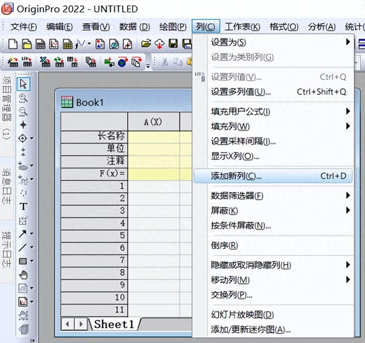
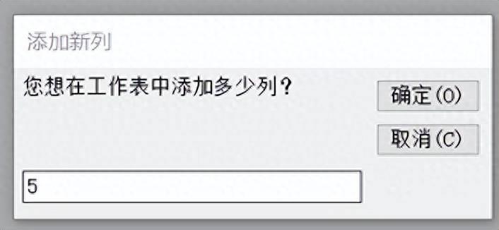
1
选择列,添加新列 。
Select a column to add a new column.
文章插图
文章插图
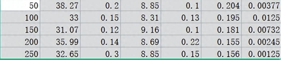
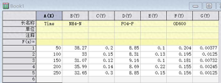
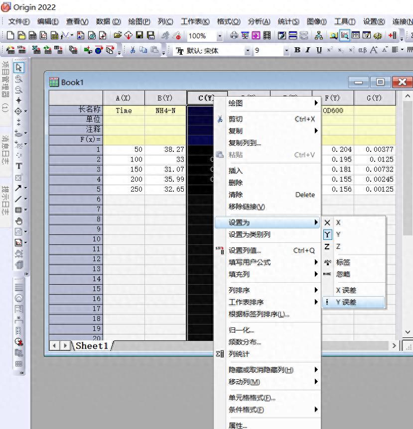
2
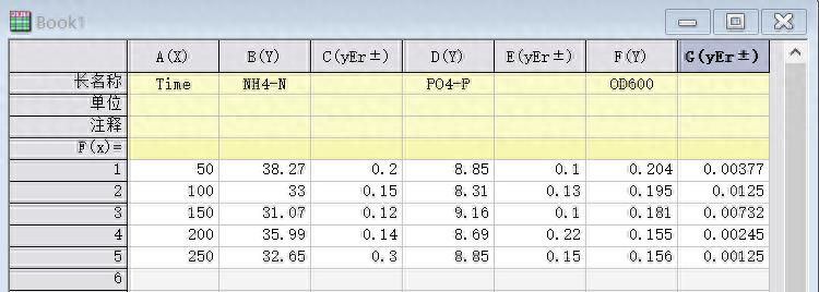
复制粘贴导入数据,将名称补充完整,右击C列,选择设置为,选择y误差,把C、E、G列都设置为y误差 。
Copy and paste the imported data, complete the name, right-click column C, select Set as, select y error, and set columns C, E, and G to y error.
文章插图
文章插图
文章插图
【origin怎么添加误差棒柱状图 做数据分析统计柱状图教学】
文章插图
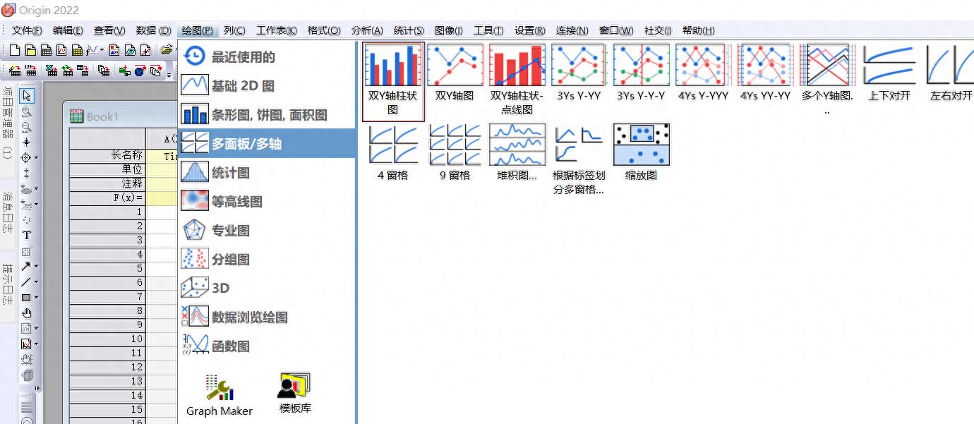
3
选择绘图——多面板/多轴——双y轴柱状图 。
Choose Plot – Multi-Panel/Multi-Axis – Dual Y-Axis Column Chart.
文章插图
文章插图
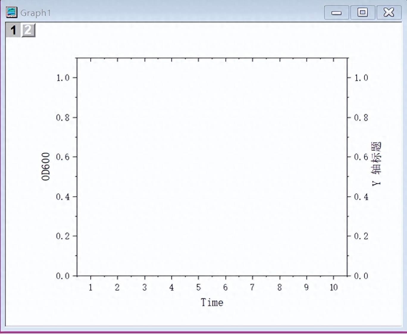
4
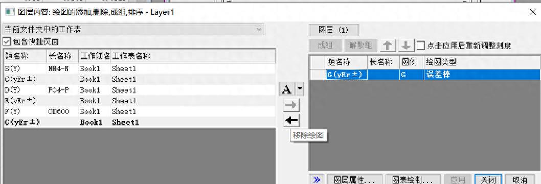
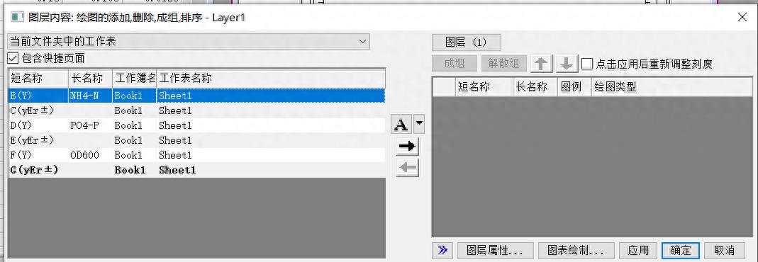
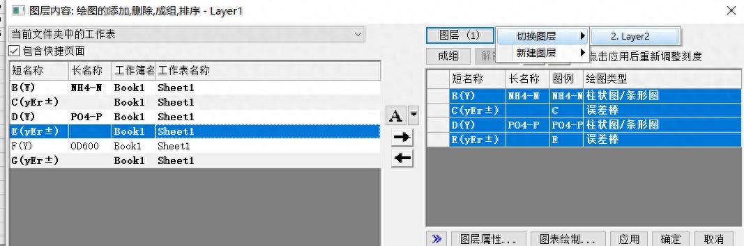
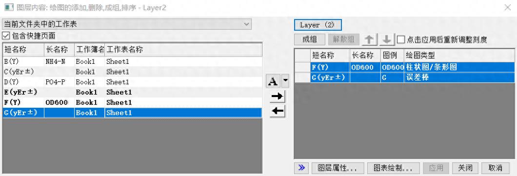
选择1图层,右击,选择图层内容,移除原有的绘图内容,将前4列添加至图层1,单击图层1,选择切换图层,切换至图层2,将后2列添加至图层2 。
Select layer 1, right-click, select layer content, remove the original drawing content, add the first 4 columns to layer 1, click layer 1, select switch layer, switch to layer 2, and change the back 2 columns are added to layer 2.
文章插图
文章插图
文章插图
文章插图
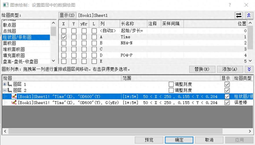
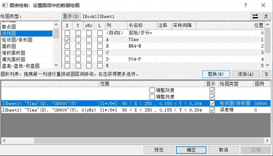
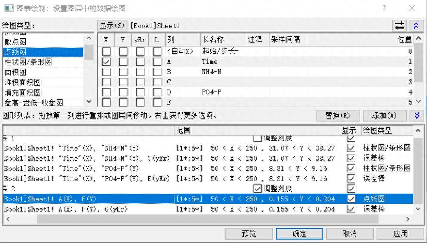
5
选择图表绘制 , 弹出图表绘制窗口,把图层2从柱状图换为点线图 , 选择点线图 , 点击替换 。
Select Chart Drawing, the chart drawing window pops up, change layer 2 from histogram to dot-line graph, select dot-line graph, and click Replace.
文章插图
文章插图
文章插图
文章插图
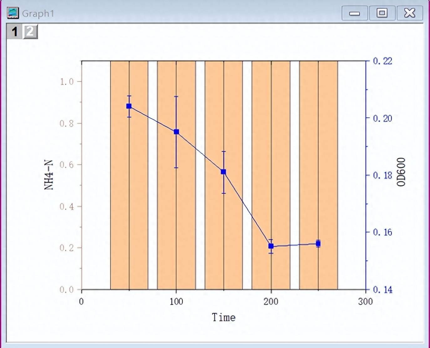
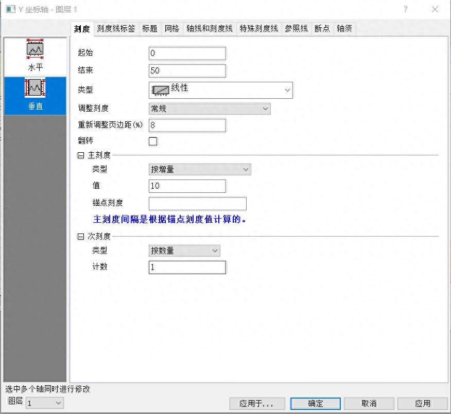
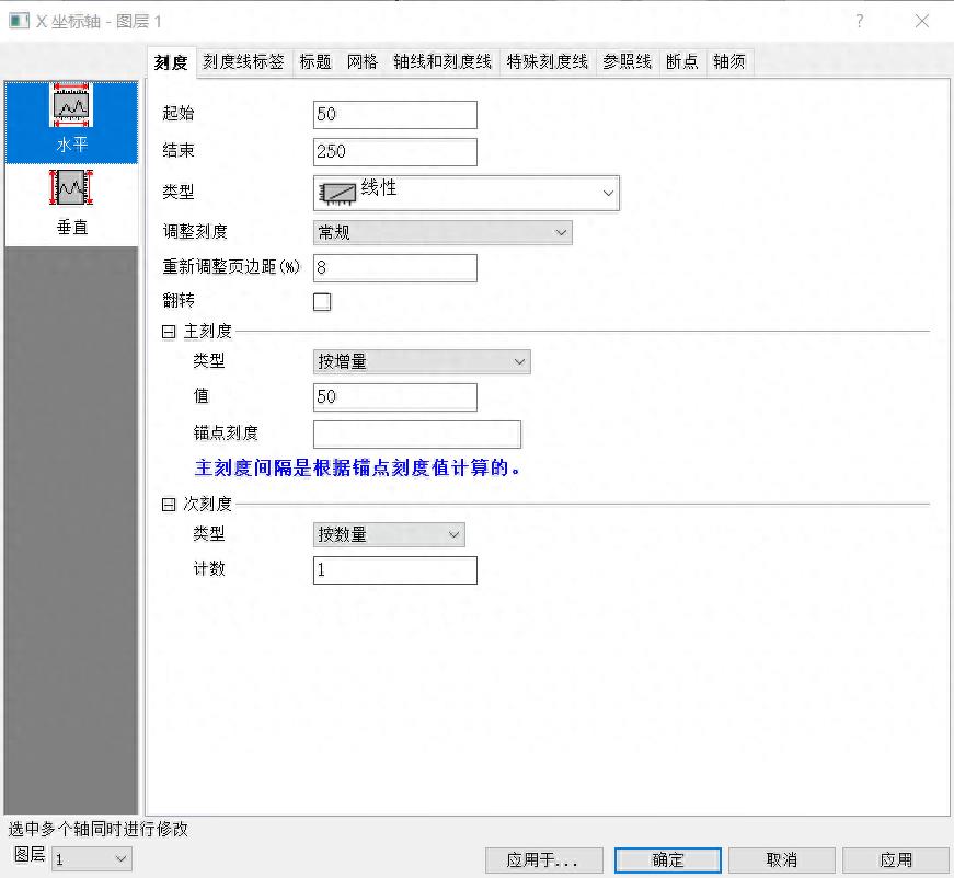
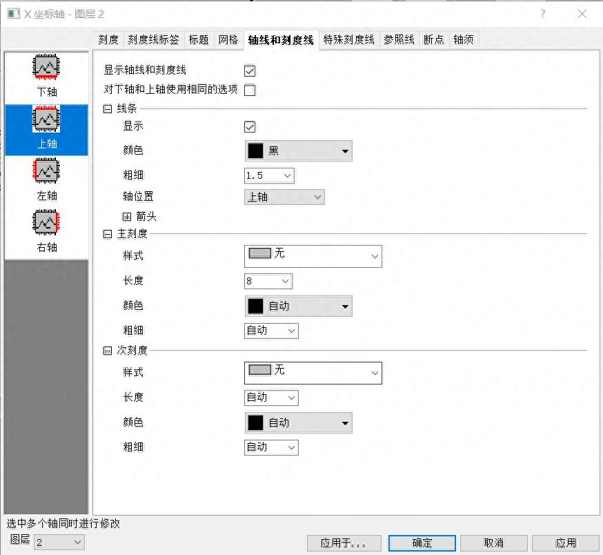
6
分别修改右轴、左轴、下轴的刻度,把上轴修改为无刻度 。双击轴线,即可在弹出的窗口中修改 。
Modify the scales of the right axis, left axis, and bottom axis respectively, and change the top axis to no scale. Double-click the axis to modify it in the pop-up window.

文章插图
文章插图
文章插图
文章插图
- teamviewer怎么远程控制电脑 teamviewer设置内网远程技术
- 苹果屏幕失灵怎么强制关机 苹果手机屏幕没反应的处理
- ps辅助线怎么精确位置移动 ps辅助线快捷键精确定位
- 怎么创建csv文件夹 制作csv文件的过程讲解
- ps怎么美白人物皮肤 ps人物美白不改变背景的调整
- excel科学计数法怎么表示 excel常用技巧大全
- 电脑卡顿反应慢怎么办 电脑速度慢的原因及解决
- 怎么把图片变成黑白线稿 彩照变黑白的方法
- 抖音怎么唱歌是自己的声音有伴奏 用伴奏自己录制自己唱歌
- ipadid怎么重新创建新id 苹果重新设置id账号的步骤