文章插图
7
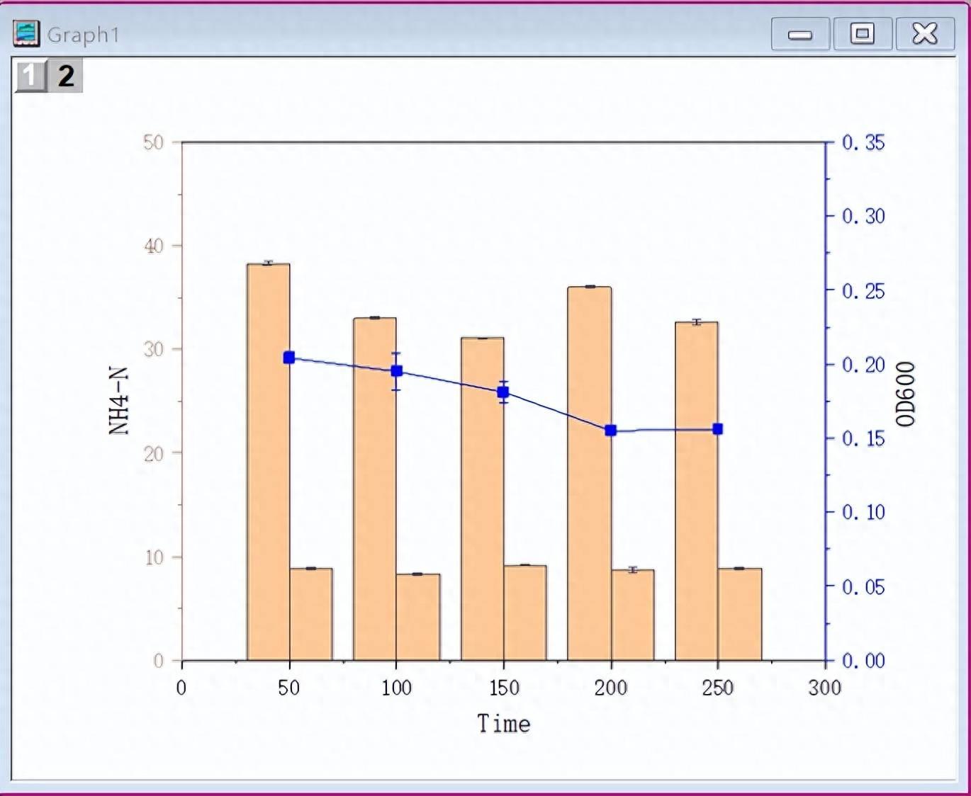
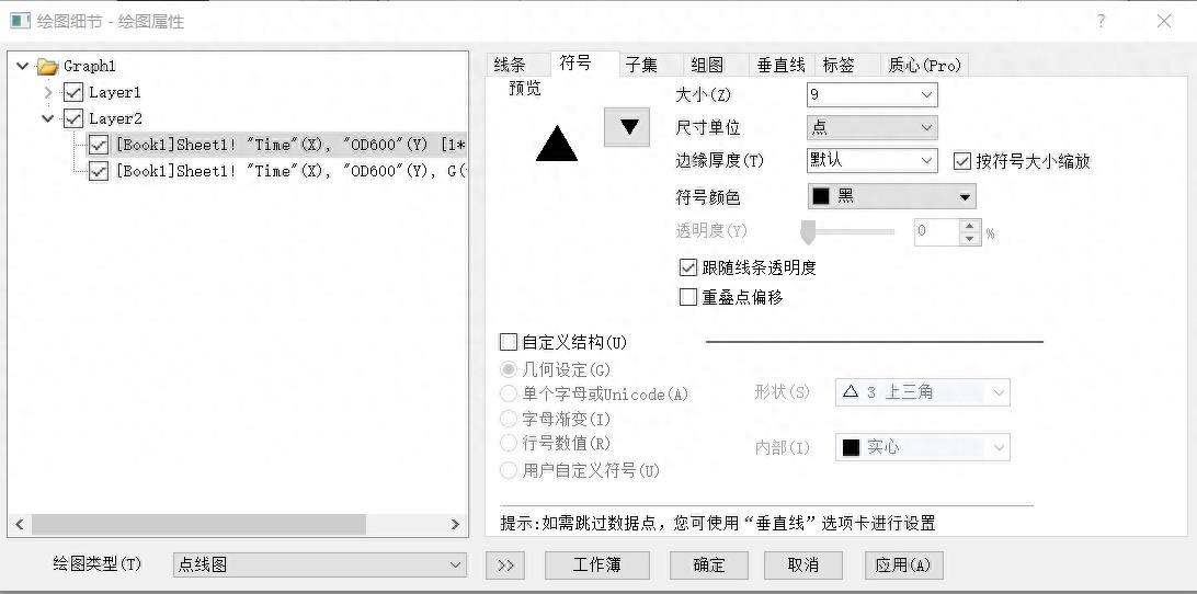
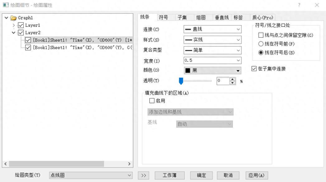
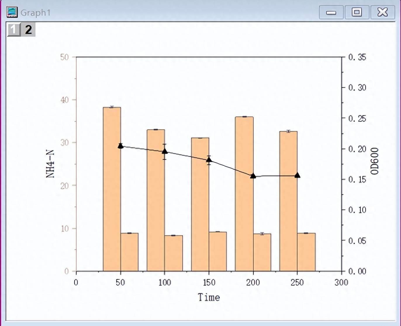
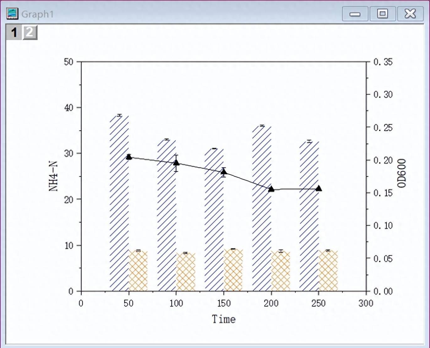
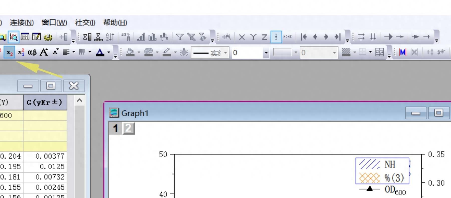
修改折线图的符号和颜色,双击折线图,弹出绘图属性窗口,符号选择三角形,颜色选黑色 , 线条颜色选黑色 。
Modify the symbol and color of the line chart, double-click the line chart, and the drawing properties window will pop up. Select the triangle for the symbol, black for the color, and black for the line color.
文章插图
文章插图
文章插图
8
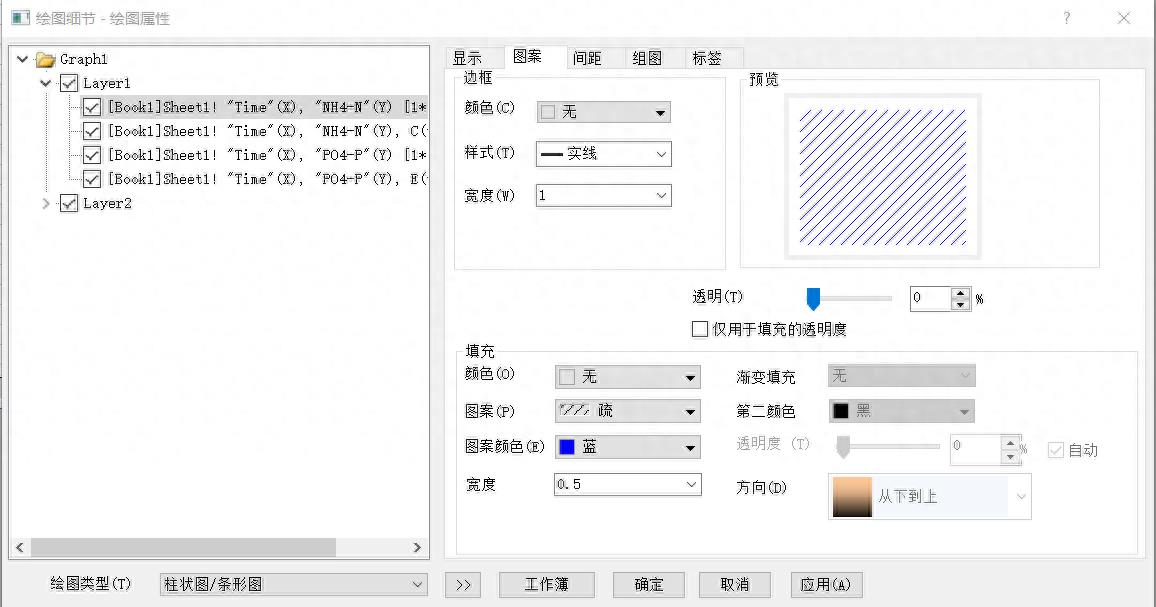
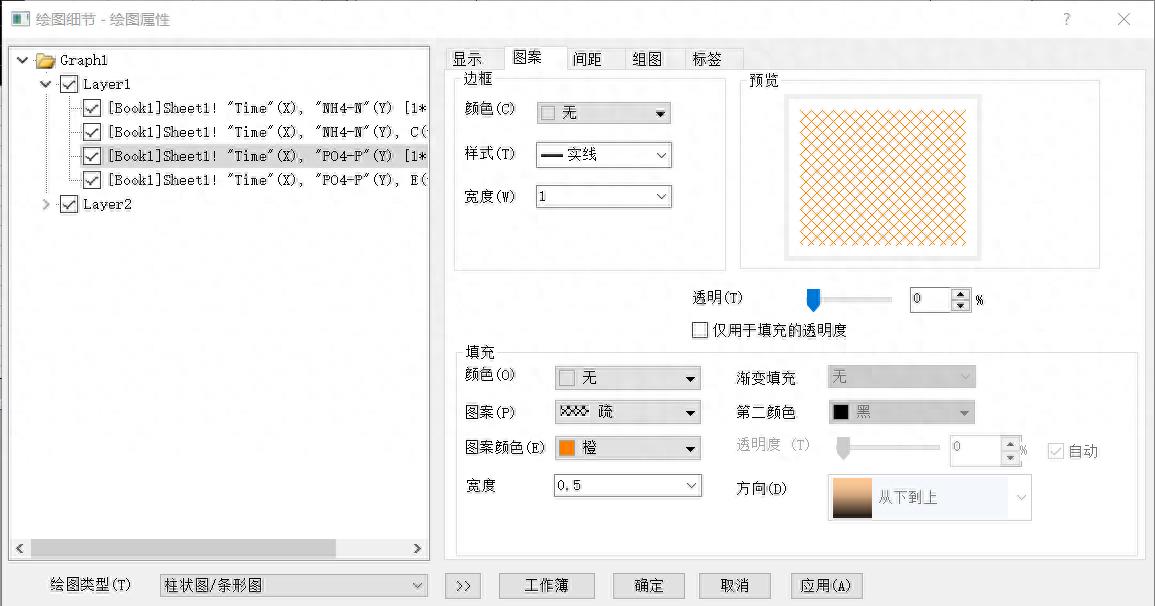
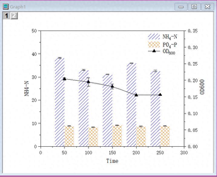
修改柱状图颜色 , 图案 。双击左侧柱子 , 将边框颜色改为无,填充颜色改为无,图案改为疏 , 颜色改为蓝 。双击右侧柱子,将边框颜色改为无,填充颜色改为无 , 图案改为疏,颜色改为橙 。
Modify histogram color, pattern. Double-click the left column, change the border color to none, the fill color to none, the pattern to sparse, and the color to blue. Double-click the column on the right, change the border color to none, the fill color to none, the pattern to sparse, and the color to orange.
文章插图
文章插图
文章插图
9
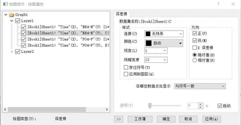
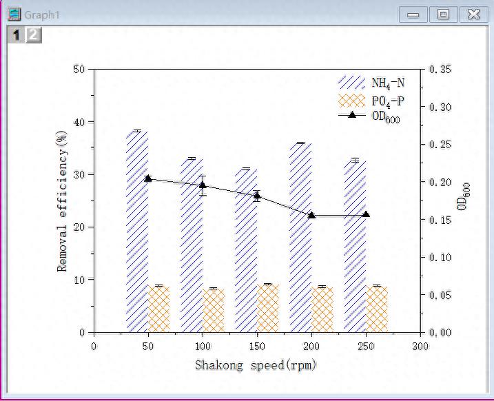
修改误差棒,双击误差棒,线宽改为1 , 线冒宽度改为12 。
Modify the error bar, double-click the error bar, change the line width to 1, and change the line width to 12.
文章插图
文章插图
10
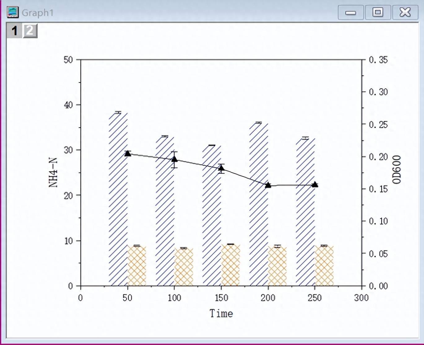
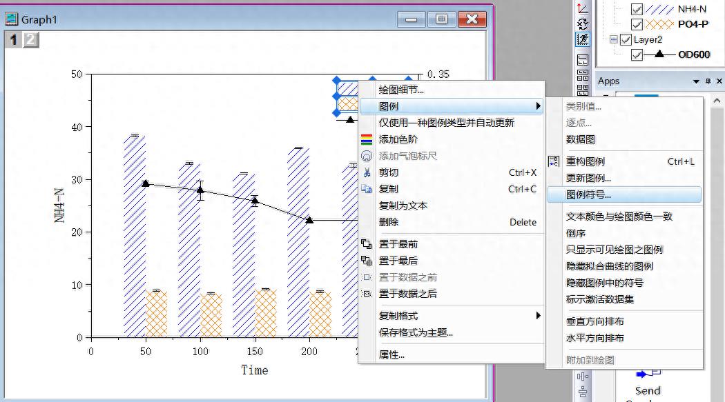
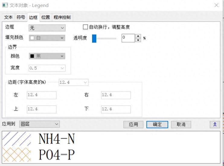
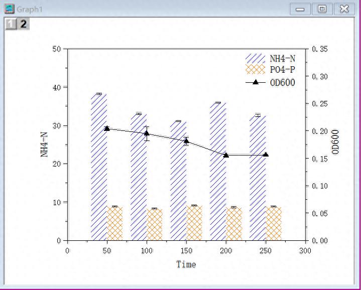
修改图例,图例边框改为无,修改图例内容的下标 。
Modify the legend, change the legend border to none, and modify the subscript of the legend content.
文章插图
文章插图
文章插图
文章插图
文章插图
11
修改y轴标题,双击内容即可修改 。
Modify the y-axis title, double-click the content to modify.
文章插图
今天的分享就到这里了 。
如果您对今天的文章有独特的想法 ,
欢迎给我们留言,
让我们相约明天 。
祝您今天过得开心快乐!
That’s it for today’s sharing.
If you have a unique idea about today’s article,
welcome to leave us a message,
let us meet tomorrow.
I wish you a happy day today!
- teamviewer怎么远程控制电脑 teamviewer设置内网远程技术
- 苹果屏幕失灵怎么强制关机 苹果手机屏幕没反应的处理
- ps辅助线怎么精确位置移动 ps辅助线快捷键精确定位
- 怎么创建csv文件夹 制作csv文件的过程讲解
- ps怎么美白人物皮肤 ps人物美白不改变背景的调整
- excel科学计数法怎么表示 excel常用技巧大全
- 电脑卡顿反应慢怎么办 电脑速度慢的原因及解决
- 怎么把图片变成黑白线稿 彩照变黑白的方法
- 抖音怎么唱歌是自己的声音有伴奏 用伴奏自己录制自己唱歌
- ipadid怎么重新创建新id 苹果重新设置id账号的步骤